

Dull as ditch water
I’ll be honest, even I find rows and columns of data by itself uninspiring and will quickly glaze over. Unless I’m reading one point in isolation the endless figures tell me nothing. Even if I’m looking at two points side by side, I will typically have to compute the ‘story’ myself and work out what changed between point one and point two.
Thus why write about something so uninspiring for a first blog? The answer to that is because data drives so much: yes, it’s tedious to collect, it’s as dull as ditch water to look at, but as shown in this first blog, what you can do with the base data will unlock so much insight which will enable you to make better decisions.
All of the blogs on this site will be grounded in a ‘data-first’ approach, hence why we are starting with my pitch for why we should make the effort to collect and then analyse our data.
Take the view below of a fictitious family record of monthly incoming and outgoing amounts, recording the actual amount received or spent each month (looking back historically over one year).
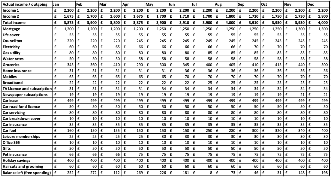
It’s aesthetically quite pleasing and neat, but tells me nothing (at a glance).
However, if we start manipulating the spreadsheet, suddenly the possibilities are potentially endless, limited only by my imagination and the spreadsheet’s formulaic and computational bounds.
Whilst it was never deliberately planned, I am sure it is not coincidental that my career has built itself around data related to project and / or business performance and turning that into something meaningful for my leadership…. Which is exactly what I was doing for pleasure with our home accounts for my own analysis and purposes. The two fed off each other, what I envisioned at home, I could take into the work environment as a new way to display something and what I learned at work (typically far more) I could bring home as a technique or concept for analysing something.
Thus, to move past the dullness of data in a table, I am always guided by two principles I have learned from my home and career:
(1) If you can’t measure it, you can’t report it.
(2) How can I turn tables of data into actionable insight, to determine if a change needs to be made.
Measurement
Using the original base data in figure 1 above, we can start to measure: in this case I went for a simple % variance of movement in the £ amount on each row between this month and last. A very simple conditional format can then be applied to each row to show if the % variance is static (yellow) to last month, improved on last month (green), or worse than last month (red).
Of course there is a subtlety that stops a blanket creation of the same rule: for our income lines we view a positive percentage movement as good, whereas for our outgoing lines we view a positive percentage movement as bad. A third rule is used for the bottom line of Balance left (free spending) which shows a progressive colouring green, with the greener the figure, the more that is left, with the exception to the rule being any negative figures is flagged in dark red.
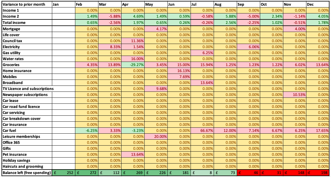
So what? Well we’ve taken a black and white matrix of figures and can now (per figure 2) see some facts and trends ‘pop’ out:
Save for April when there was perhaps a crash diet, the grocery spending line is increasing month on month, every month.
From July the car fuel line increases month on month, again, every month.
From September onwards we have been living beyond our means.
Even though it clearly isn’t one dimensional, we could say that Figure 1 was one dimensional, and that Figure 2 is truly (by definition) and look, two dimensional, but it is still lacking something: is there a trend yet to ‘pop’ out at me, a longer term running trend?: all Figure 2 is giving me is a month by comparison of percentage variances, but I can’t see the actual trend to the £ changes behind that, or indeed anything cumulative.
Actionable insight
So if I look at Figure 2, I know that I have a problem, but perhaps it’s not yet graphically obvious to me where the trends are that are causing this. I need to take that two dimensional view in Figure 2 and turn into in something more three dimensional. (We’ve already accepted the artistic licence that Figure 1 wasn’t one dimensional, thus we’re extending that liberty and accepting that Figure 3 isn’t truly three dimensional: I could make the bars three dimensional, but I chose not to as it is no longer the 1990’s).
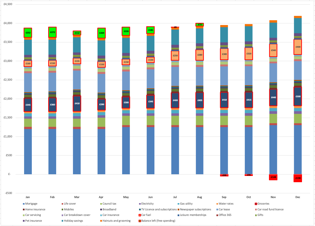
If we quickly review this stacked column chart 3 items readily ‘pop’ out and that’s before I highlighted them with a thick red outline and put the £ cell values in:
The bright green box at the top (representing Balance left (free spending)) is clearly on a reducing squeeze, trending downwards, before it inverts in September and continues to worsen.
If most other categories of spending look (relatively) stable, what is driving this overall reduction in our Balance left, to the point of inversion and living beyond our means?: The dark blue groceries (in the middle of the stack) have grown from £345 per month in January to £500 per month in December, and we can see this isn’t just a one off ‘hump’ for December, but rather a gradual consistent increase. Similarly the salmon coloured line for car fuel (whilst on average smaller in £’s than groceries) is consistently increasing and by the end of the year is considerably more than double where it started in January.
Story told
With a contrived set of figures, we’ve taken a one dimensional table of data that (at a glance) told us nothing, we’ve applied some comparative % views and conditional formatting to get a view of where variances sit and where we should potentially investigate. We’ve then brought the data to three dimensional view with a stacked column chart which visually shows us where the £ problems are and where we should focus to take action.
Yes, we could have done so much more analysis and charting: but this first blog was not seeking to give a masterclass in charting or trend lines or multi-purpose combination charts, this is simply a starting point as to why we love data and will base everything around it.
Blog 2 will build on this theme of data, not only showing how it can tell the story, but also be used for inspiration: where I shall share a personal experience of data driving a planned 18% loss of my body weight and how I achieved that in just over 100 days, something I would not have achieved without a ‘data-first’ approach.
Disclaimer: The content of all blogs is written solely from my experiences and does not represent any form of financial advice, recommendation or suggested action.
© 2026 Personal Financial Governance. All rights reserved.